Re-branding, Website, Print Design
Coolum
Netball
Location → Coolum Beach/AU
Year → 2022
Key words → Feminine, Sport, Movement

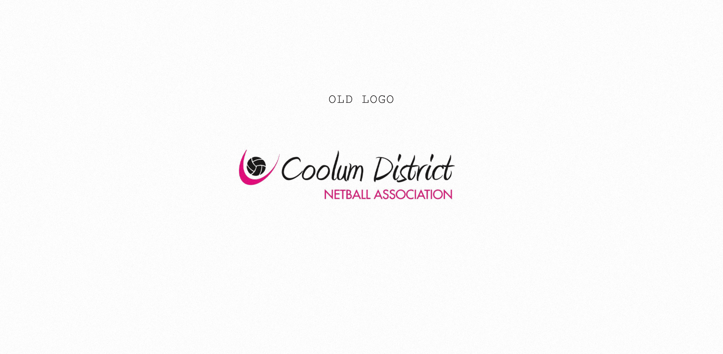
Late 2021 I was contacted by the Coolum Netball Club committee with the need of a new website design and logo redesign. They weren’t ready for a huge change, so they asked I keep the main features of the logo and just freshen it up a little bit.
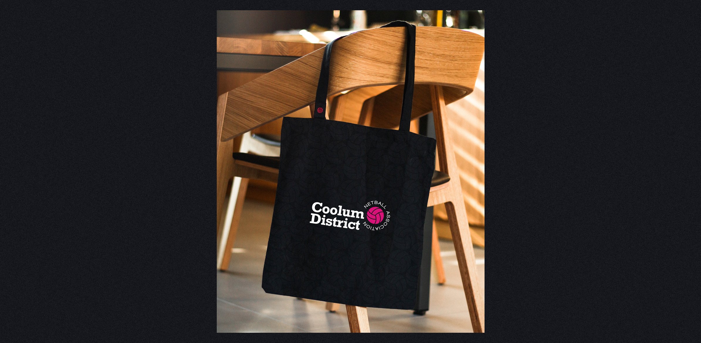
I chose to modernize the typography and rearrange the components of the logo. I made some fine adjustments on the symbol and got rid of some unnecessary elements. I kept the black and pink colours, as they are strongly linked to the team. The new design is bold, modern and easily recognizable when applied to their uniforms and t-shirts.
The website was a bit of a challenge - I had to be creative and organized with the content, which was too much text and too little imagery. The solution was to keep it very clean and easy to navigate, as to ensure the information could be quickly found and read effortlessly, without being exhausting for the user.